- Date:01.19.2021
- Client:GRO Savings And Loans
- Categories:Brand Identity
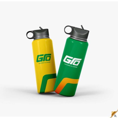
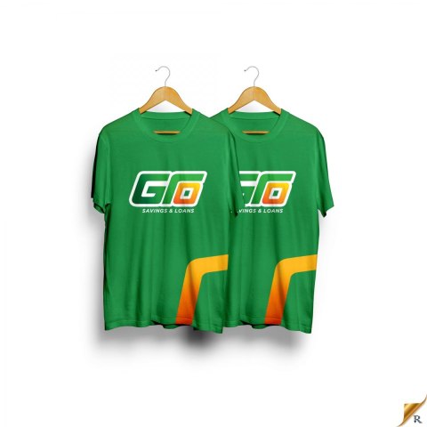
The primary element of the logo is a stylized lettermark featuring the acronym “GRO” and “Savings and Loans” positioned beneath the GRO lettermark. The design is clean, modern, and easily recognizable. The chosen font conveys professionalism and trust, aligning with the financial nature of the company. The colors used are green and gold to reflect the brand identity.
The GRO lettermark symbolizes growth, reliability, and financial stability. The overall style of the logo is versatile, allowing for easy application across various mediums, including digital and print. It also works well in monochrome for situations where colour is limited.


